Safety Mode for UPI Apps
How do we design for users in a state of panic? This case study explores how to introduce deliberate, protective friction into UPI apps, creating a brief but critical window for reflection before a transaction is completed.
Role
UX Research & Design
Timeline
6 weeks

Context
UPI is built for speed. While this works for most daily transactions, it creates a significant risk during high-pressure situations. When a user is being rushed, often by a scammer or a perceived emergency, the interface does not provide enough time for them to realise they are making a mistake.
My research focused specifically on how this lack of friction disproportionately affects elderly users, who are frequently targeted by social engineering scams.
The problem space
Existing safeguards in UPI apps do very little to intervene in these moments. They rely on the user to slow themselves down, even when urgency is actively working against that.
Under pressure, attention narrows and actions become automatic. In this state, a standard confirmation prompt is easy to ignore, and the system offers no additional support to interrupt the flow.
How decisions break under pressure
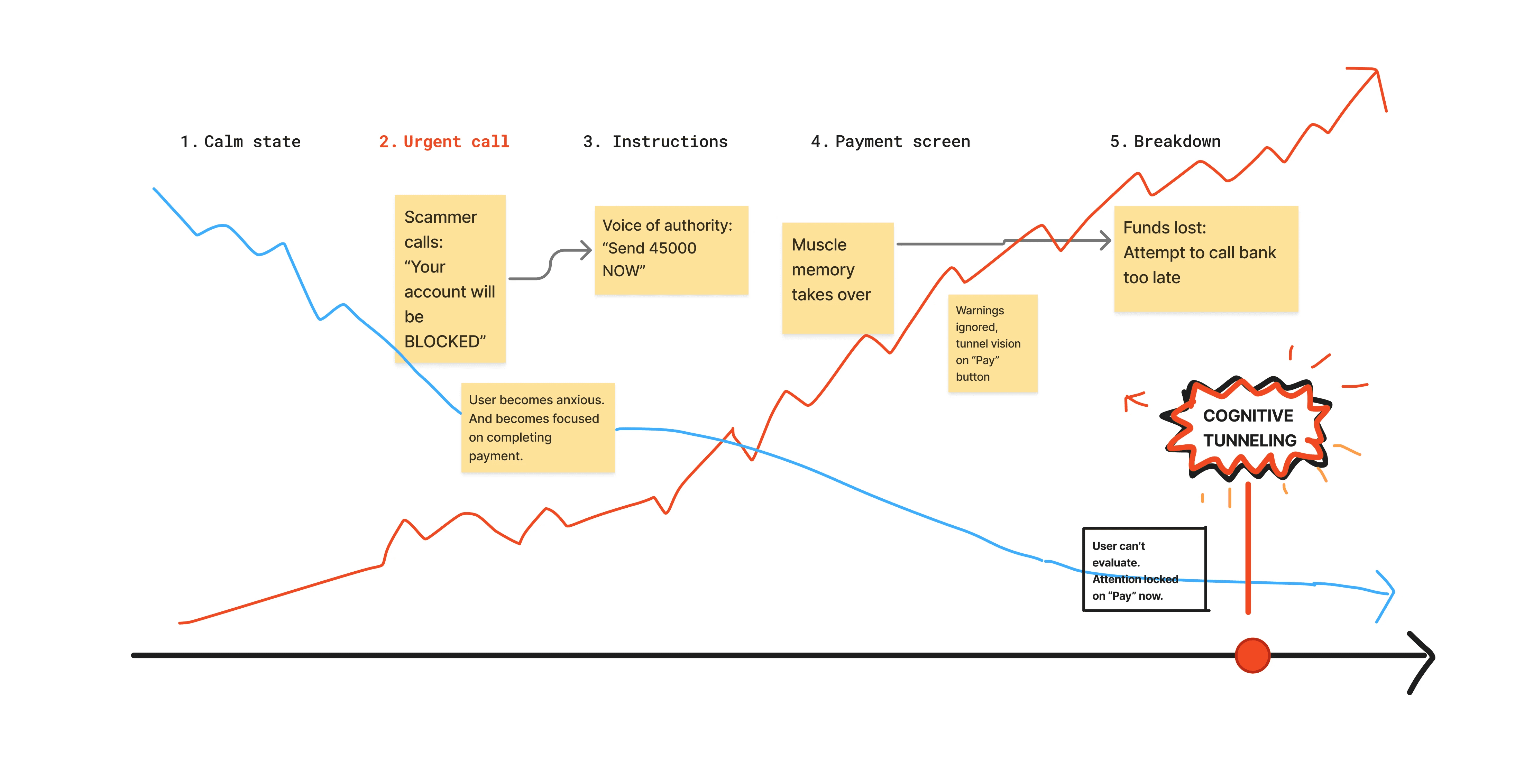
To better understand how scam situations unfold, I mapped the sequence of behavioural shifts that occur under pressure.

This shift from deliberate to automatic action became the key moment to intervene in the payment flow.
User Research
To get the real story, I moved away from the scripted surveys and sat down for some informal interviews with users over 60. I wanted to see their mental models in action - not how the app is supposed to work, but how they think it works when things get stressful.
The goal was to find the edge cases: those specific moments where a scammer's pressure makes the "easy" design of UPI feel like a trap.
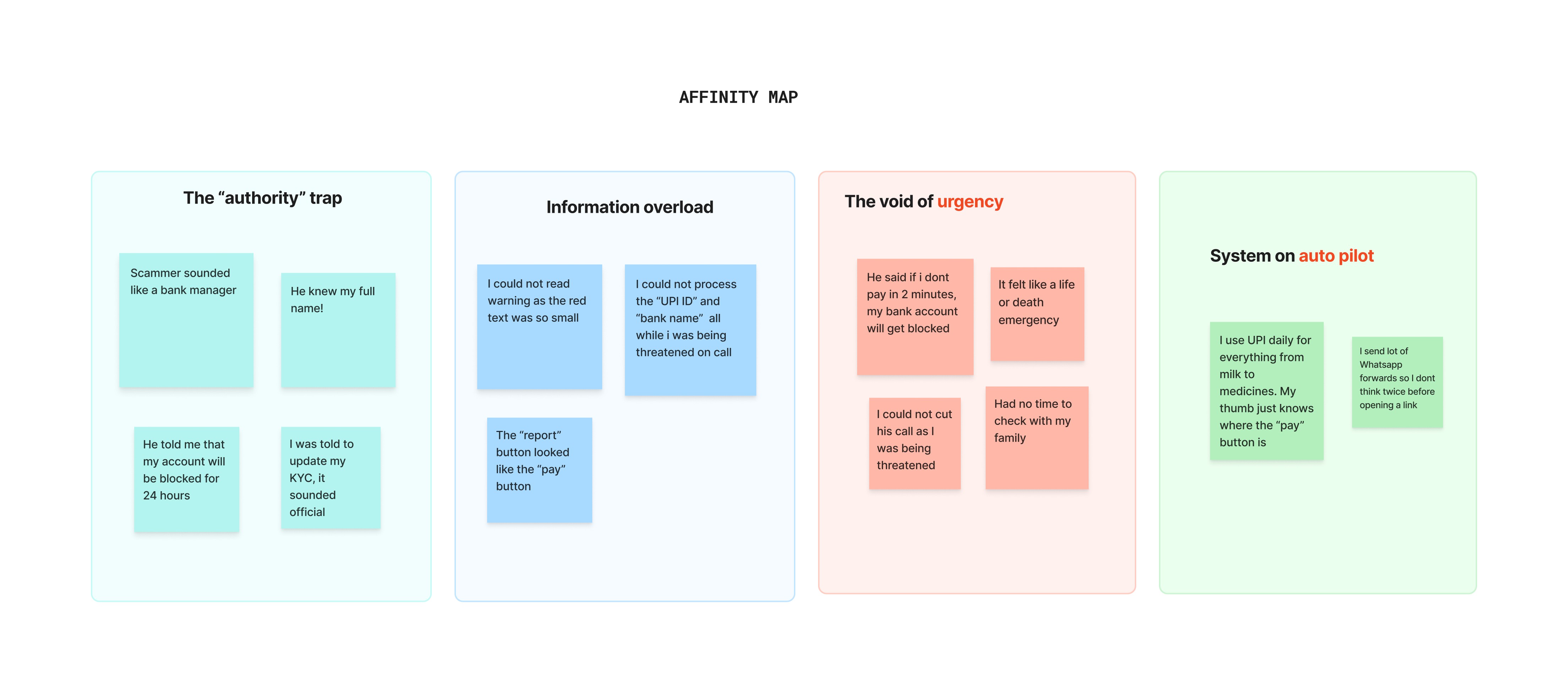
Using what I learned, I mapped out a behavioural journey map that isn't about a "happy path". It's about the stress path. It tracks how, as a scammer ramps up the pressure, the user's cognitive clarity drops to zero.
I call this "cognitive tunneling" where the user is so focused on the "Pay" button that the security warnings become invisible.
At stage 3 (the scam call), the cognitive load spikes. This is the moment when "muscle memory" takes over and the user stops processing information. At stage 4 (the payment screen), the anxiety is at its peak. The standard warning popups are useless here since the user is already in a state of cognitive tunneling, looking for the "pay" button.
Design Intervention
The research led to a shift in how the interface should behave when a high risk scenario is detected. I defined a "risk scoring system" where the goal was to trigger an intervention where a combination of behavioural and systemic signals are met.
The system evaluates four primary signals to determine the level of threat.
Unfamiliar payee: First time interaction with a non-contact UPI ID.
Unusual amount: Significant deviation from the user's 30-day average.
Rapid entry: Navigating instantly from an outside app, like WhatsApp, straight to the payment screen.
Reported account: A recipient ID that has already been flagged by the bank or other users.
Based on the cumulative score, the interface switches between two states: a single flag might only trigger a soft warning, but when three or more of these signals happen at once, the system triggers a full intervention.
Introducing 'Safety Mode'
When the system triggers a full intervention, it replaces the standard "Pay" button with a mandatory 30-second timer. Instead of letting the user rush through a familiar sequence of taps, the interface intentionally slows down.
To strengthen this, I added a social safety layer where the users can quickly reach out to family members or trusted contacts before proceeding with the payment.
The call option is embedded directly in the payment flow so users do not need to leave the app. A quick conversation can help validate whether the payment request is genuine.
View the Interactive Prototype here


Reflections & Impact
This project taught me that the most invisible parts of an interface, the ones we navigate through muscle memory, are often the most dangerous. In a typical payment flow, we’ve trained ourselves to tap and verify in seconds. But when a scammer introduces a sense of urgency, that very same habit becomes a trap.
My goal wasn't to build a smarter algorithm, but to design a more observant interface. By introducing a mandatory pause and a direct line to a trusted contact, I wanted to create a space where the user could step out of the transaction for a moment. It’s about recognizing that in a high-pressure situation, a person doesn't need more "information" - they need a moment of quiet to regain their own perspective.
Ultimately, I’ve realized that a banking app has a responsibility beyond just moving money. It should act as a guardian that knows when to stay out of the way and when to step in and ask, "Are you sure?" It’s a balance of maintaining trust in the system while giving the user the agency to trust their own intuition.