Art Gallery Companion App
Ethos is an editorial style museum app designed to preserve the "flow state" of gallery exploration. The app prioritises a minimalist, scan-first architecture that delivers curated insight on demand, ensuring visitors remain immersed in the physical art, not the digital interface.
Role
UI/UX Design
Timeline
12 weeks

In a gallery, visitors constantly choose what to look at, what to read, and what to skip. Shifting between artworks, wall text, and audio fragments attention and disrupts viewing flow.
Ethos is a mobile companion designed to support cognitive pacing and orientation during gallery visits.
Problem space
Wall labels and traditional audio guides are the main ways visitors access context in galleries. They are often dense and static in format. This causes high cognitive friction for visitors, requiring sustained effort to locate, read, and process information, which detracts from the actual aesthetic experience.
Overtime, this can lead to information overload and museum fatigue, where visitors may skim context briefly or disengage from it altogether.
User Research
Informal interviews and observation were used to understand how gallery visitors naturally access information during a visit.
"I usually follow what catches my eye"
"I prefer small amounts of rest. Anything bigger feels like work"
"I often skip the text thinking I'll come back to it later"
"I only read more if something really connects with me:"
User Persona
Swati visits galleries during weekends, and while travelling, or as part of a broader cultural outing, rather than formal study. She enjoys learning about different art forms and its history.
FRUSTRATIONS
Understand art with ease
Self-directed pace
Quick access to context
Save resonant pieces
BEHAVIOURS
Spends 1-3 minutes per artwork
Non-linear exploration
Moves on when effort rises
Uses phone discreetly
Competitive Audit
SMARTIFY and BLOOMBERG CONNECTS act as universal guides for museums across the world. However, their interfaces are designed like digital encyclopedias, which make them great for research and art exploration, but overwhelming to use while navigating through a physical gallery.
DAILY ART and WIKI ART have slightly different product offerings, where they have users engaged with daily highlights and personal collections, but aren't tied to a physical location. Daily Art provides curated history lessons from experts, while WikiArt functions as a vast, community built database.
Most existing apps are either heavy databases or 'at-home' learning tools. There is limited support for lightweight, real-time orientation that helps users focus their attention within gallery spaces.
Design Principles
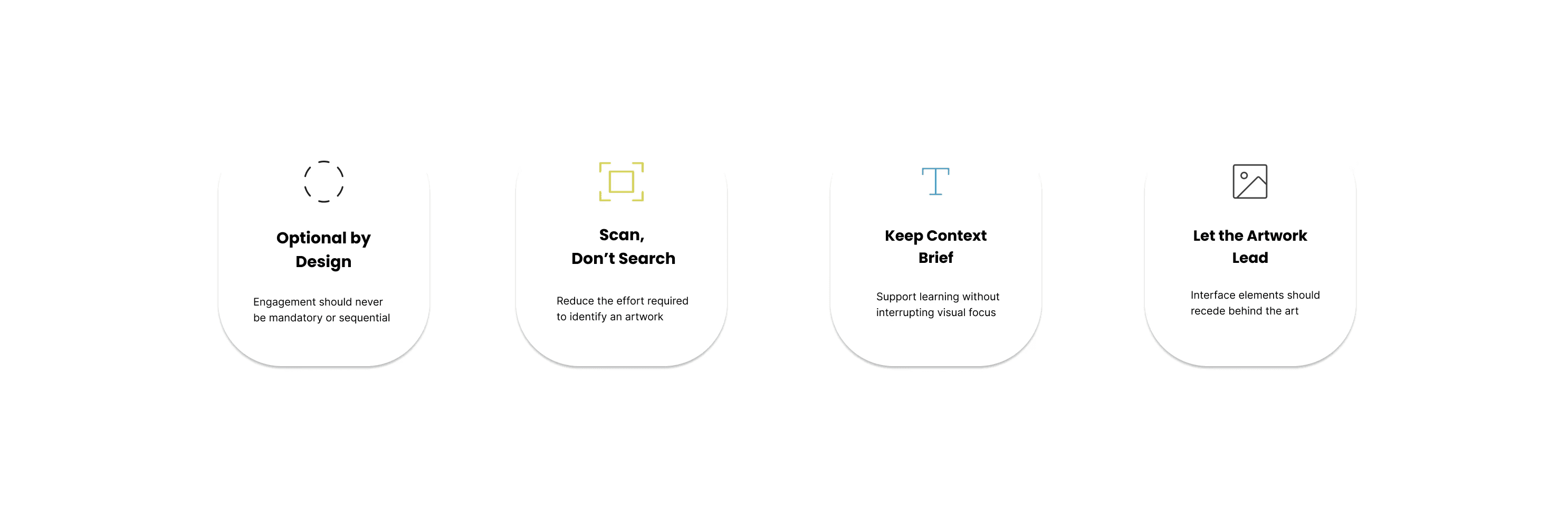
Insights from research were translated into design principles to guide how the companion supports viewing and exploration in the gallery.
Information Architecture
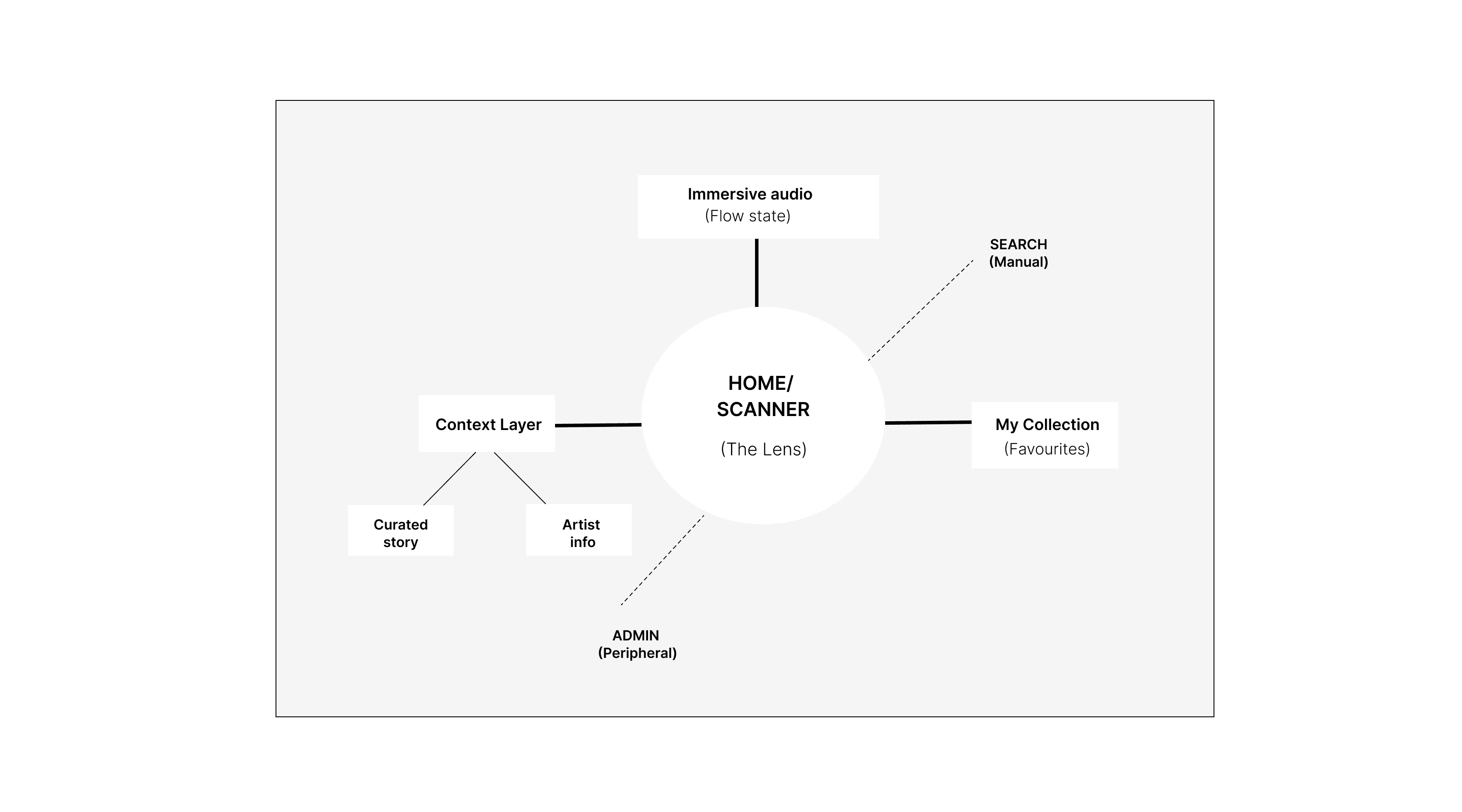
The app structure follows visitor movement through the gallery – noticing, pausing, shifting between artworks. Each artwork acts as a central node linking visual, textual, and audio context within a single place.
Primary User Flow
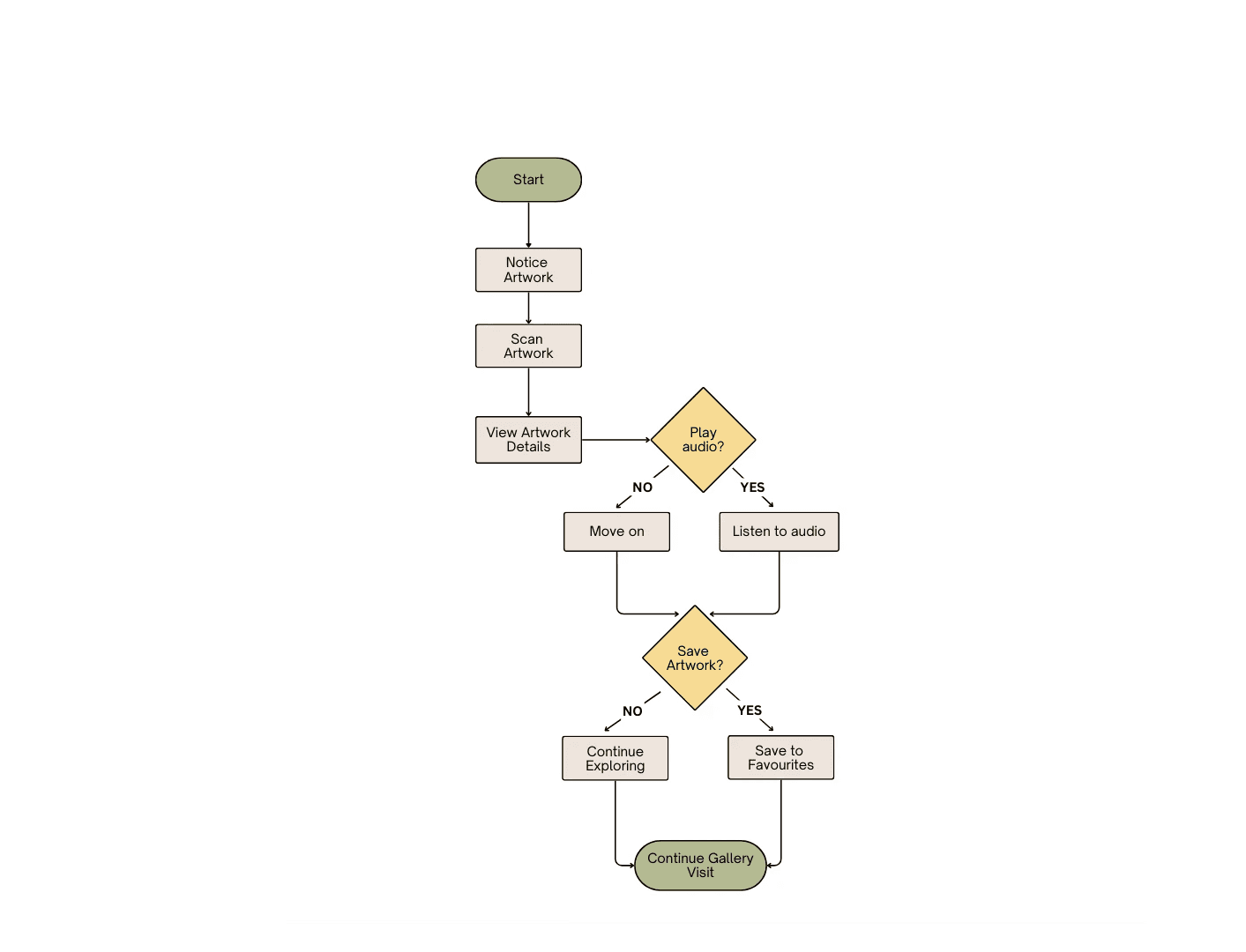
To protect the user's flow state, this primary path eliminates deep navigation menus.
Every decision point is reduced to binary choice (Yes/ No) ensuring the digital interaction is a brief bridge back to the physical artwork. This helps reduce choice paralysis.
Early Wireframes
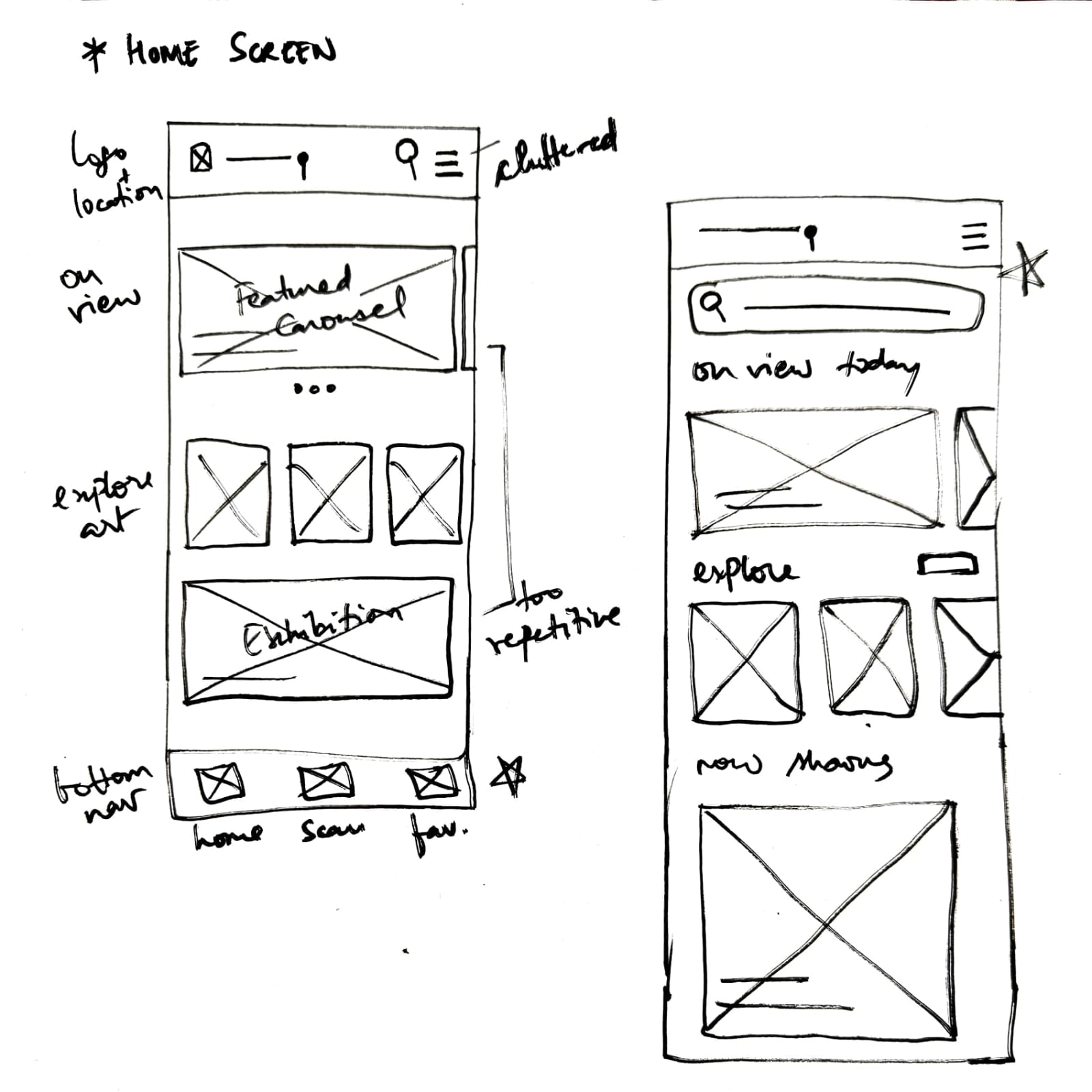
Refined the top navigation by elevating 'search' into a separate input field (improving visibility)
Reworked exhibition layout to have visual distinction and avoid repetition with the highlight module.
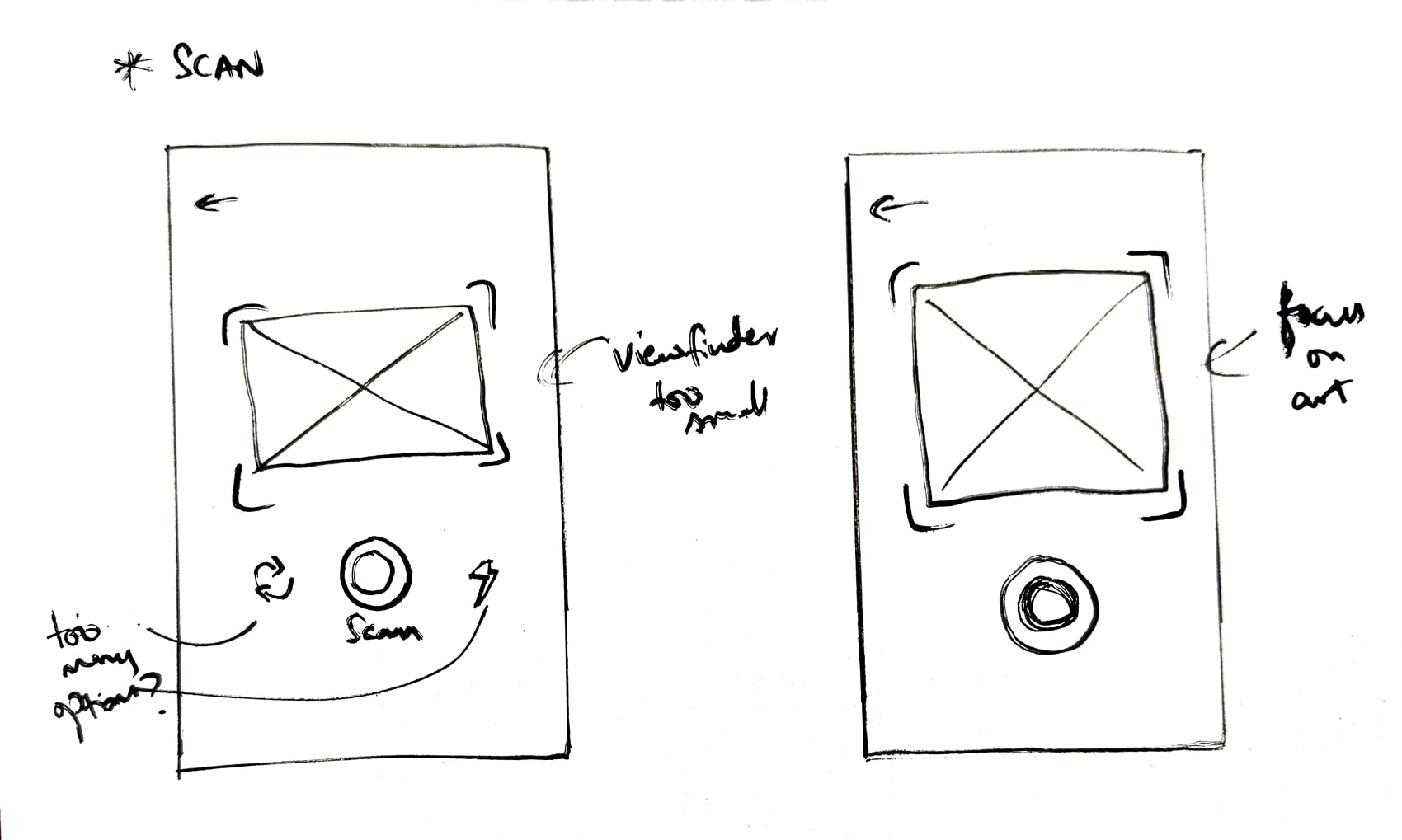
Simplified scan interface by removing secondary controls such as retake and flash.
Expanded artwork preview area for scan - to reinforce visual focus
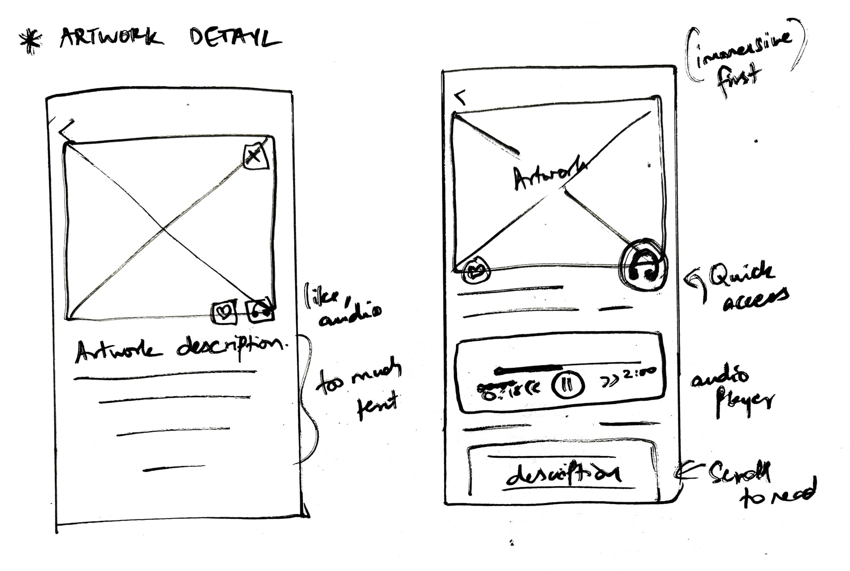
Elevated audio control into a prominent floating action button positioned within natural thumb reach - primary interaction button
Kept 'Read transcript' secondary to reduce visual noise
Low Fidelity design
Mid-fidelity screens exploring layout, spacing, and interaction clarity before final visual styling.
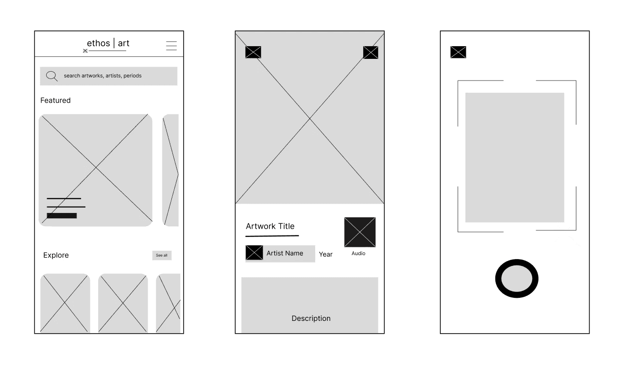
High Fidelity screens
The final designs are informed by behavioural insights around attention, pacing, and information processing in gallery environments.
Interactions are structured to reduce decision fatigue and support lightweight exploration. Information is revealed progressively in the audio feature, where long form text recedes to prevent divided attention.


Reflections
Designing Ethos clarified how much of digital experience design is about restraint rather than addition. Early iterations leaned toward providing more information and more control. Through research and refinement, the focus shifted toward reducing cognitive effort and allowing the artwork to remain central.
One limitation of this project is the lack of real-world behavioural testing. The scan interaction and audio placement were informed by ergonomic principles, but not validated in a live exhibition environment. Future iterations would prioritize contextual testing to understand how visitors divide attention between physical space and screen.
Additionally, I would explore personalization – allowing visitors to adjust audio length or content depth based on their engagement style. This would better reflect the variability observed in research.